Tuesday, January 8, 2013

Yay for Art!

ur gon die hehehehheehe

What Happens Next?
The picture above was done in Photoshop. YAY FOR PHOTOSHOP!
The fisherman beams at the camera, proudly showing off his catch, while unbeknownst to him he is quietly being stalked by a vicious predator.


 Landscape Acrylic Painting
I guess this is China... I just typed in "Asian Background" and chose this one.
We used acrylic paint... YAY FOR ACRYLIC PAINT!


Clay Tile
So... this is a wolf howling at the moon. It's made of clay and it's a tile.
I gave it to my dad as a christmas present... he didn't seem very excited............... :c


hi nick can you see this? c: ♥


Tuesday, December 11, 2012

Game Drawings in Perspective


To make this piece, we used watercolor paint (being careful about blending the colors together ) and then after the paint was dry, we went back over the painting with colored pencils. Depending on the amount of paint overlapping, the gradation will change. To create highlights or shadows, you simply add more paint for shadows or leave only a little bit of paint on a spot for the highlight.
One thing I enjoyed about this project was the use of watercolor paint. Also, it was color learning how to use vanishing points and perspective to create the cubes, rectangles, and so on.


Monday, November 19, 2012

Anamorphosis Critique


1. In photoshop, I used the transform ability to fatten the top of the picture. The scale had it as the top being way larger than the bottom, but also so that at a different angle, the book looked almost 3D.

2. By distorting the image, the resulting anamorphosis (when seen from an angle) appears to almost be 3D. When most pictures are seen, they look flat, 2D, and not life-like. However, change the perspective of the picture and it all changes.

3. When getting ready to draw the picture, it's better to draw a grid, then draw your picture box by box. Then, with colored pencils, I added color and shadows to create the life-like affect. The color values of the book had to match the colors of the picture I printed, but also had to be realistic, something that would trick the brain into thinking, "Ah, yes, that is a book... and it is real."

Famous Landmark or Transportation Stencil Critique


1. While in the lab, I went into Photoshop and pasted in the picture I was going to use for the stencil. The composition consisted of a good balance of positive and negative space. Also, while in Photoshop, I activated the threshold in order to make creating a stencil from the picture possible.

2. The stencil I made is a Korean popstar, so when I was choosing the background, I didn't want things that were totally not related. I chose to stick with nice scenery pictures (Gardens, Mountains, etc) as well as a good balance/contrast of colors (Green, Pink, Blue, Black). I tried to refrain from anything too old fashioned looking as well as pictures of people that didn't have any relation to Korean popstars at all.

3. By utilizing the threshold in photoshop, I was able to identify the negative and positive space in my photo. I chose to cut out the negative space, which in this case was the white.

4. When using the xacto knife, you had to move slowly, and be careful not to yank the knife really hard and cut yourself. It was a bit aggrivating having to move so slow, but better safe than sorry.

5. When doing the spray paint, I chose to go with simple black and white. At first, I did the stencil with only black, but the collage made it hard to see the facial features, so I went back and spray painted some white over the face. Then, I spray painted black over the stencil again, and it came out perfect.

Monday, October 22, 2012

Print Making


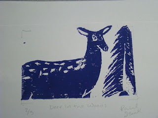
 1. I think my finished project is pretty balanced. I have the tree on the right and then the deer on the left, taking up most of the page. Maybe something could have been in the top left corner, but then again I wouldn't want the print to look too crowded.

2. To add texture and contrast to my print, I used one of the cutting tools to carve out the deer's spots, as well as the tree's branches. I made sure to make it kind of choppy to give it a better feel.

3. I used positive and negative space to create my image. First, I had to draw the picture out, then I figured out what I was going to cut out and what was going to stay by finding the positive and negative space within my drawing. I figured it would be easier to cut out the background than it would be to cut out the whole deer and tree so I decided the negative space would be the spots and background, and then positive space would be the deer and tree.

4. I would say overall my project was crafted pretty well. The nose and eye on the deer could have been made a little better if I'd had an even smaller tool, and the tree could have looked more tree like if I'd known how to make it have a more realistic texture.

5. I think I was able to achieve depth. There may be only two things in my print, but the fact that the deer is so much bigger than the tree establishes the fact that the deer is closer to the viewer than the tree is.

6. I think the Print Making project was fun. It was kind of annoying to have to trace the print multiple times onto multiple surfaces, and when we were rolling the ink out on the table it was harder than I thought it would be to get it up. It was fun carving into the stamp with the tools, but it was somewhat hard to do the small details with the tools provided.

Thursday, October 4, 2012

Chalk Murals & Print Sketch


Chalk Murals

1. For the most part, the group was pretty cooperative, and worked well together. Some of the members did not work as hard, and did not seem to care too much about whether or not the job was done well, just that the job was done.

2. When working in a team, it is very important to get along with your members, otherwise whatever project you are working on or trying to accomplish might not get done properly, or even get done at all. If a group is having disagreements about something or another, it's best if they work everything out and come to a solution soon, so that they don't end up wasting all their time arguing.

3. In my opinion, the project was pretty successful. Besides the fact that some of the members continuously had to be sought out and brought back to the group's area. There were many people who (having finished their projects) were willing to help out ours, since earlier on in the week, it had been completely washed away.

4. I like creating art that others are able to interact with. When I create just normal art, people look at it, sometimes compliment me, and move on. But, making interactive art where everyone can see it, gives me a whole new feeling. I feel like my art is more appreciatiated and more enjoyed that way.


Print Sketch

1. Without texture, an image just looks flat. It appears non-realistic and boring. If you drew a fish without the scales and without the slimy glint, it wouldn't even look like a fish, it might have the shape and structure of a fish, but it just simply won't look good. By adding texture to a sketch, you're adding life to your art.

2. One picture of an animal, is not able to get the entire shape and structure of an animal. You may have a picture that gives a perfect frontal view of your animal, but then what about the back? The sides? Does your animal have a tail? Does it have a different pattern on its side than it does on its chest? By utilizing multiple pictures as a reference for an animal, you are able to see many things you may have missed if you'd only used one picture as reference.

3. When I look at my sketches, I immediately am able to pick out which sketch, in my opinion, is better than the others. My final sketch may sometimes be a little sloppier because my hand is tired of drawing, or my very first sketch may be a little wonky because I haven't really gotten the hang of drawing whatever object/thing I'm drawing. When I'm picking which sketch will make the best print, I'm simply picking the one that has the best visual appearance, in my eyes.

Friday, September 21, 2012

Value Portrait Drawing


1. In order to make this drawing, we took pictures of other people in the class and traced the shapes of the shadows onto tracing paper. We then shaded the backside of the tracing paper, and turned it over to trace back onto a clean sheet of paper. When we finally had the outlines of the shadows on our paper, we began shading the shapes according to how they looked in the photograph.
2. I found the different values in the portrait by starting with the shadows that were of a medium shade. Then, I worked my way towards the lighter shadows, and eventually the darker ones.

3. I did achieve a full range of different values within my portrait. I had to make sure I shaded the shadows exactly as they were shown. My portrait isn't perfect, but at least it shows that I'm not afraid of the dark.

4. I like to think that my art is "executed and crafted neatly," but I think everyone has a different opinion. Mine at least is that I did a pretty good job for the most part.

5. I had a hard time drawing her hair on the right side (of the photo), the shading was awkward and I couldn't figure out how to make it look good. However, I eventually managed to get her hair to look decent and am quite satisfied with the result.